> ## Documentation Index
> Fetch the complete documentation index at: https://docs.clickterm.com/llms.txt
> Use this file to discover all available pages before exploring further.
# Widget appearance
> Customize the look and feel of your clickwrap dialog and inline widget — colors, layout, and branding.
The **Preview & Customize** section lets you preview how the template content will be displayed to end users across the Web and Android SDKs, and customize the widget's appearance. ClickTerm supports two display modes — each with its own preview and customization workflow.
Some customization options are available only on paid plans. Visit [clickterm.com/pricing](https://clickterm.com/pricing) for plan details.
## Clickwrap content
The clickwrap content is displayed as a **full-screen modal dialog** when using `ClicktermDialog.show()`. Starting from **SDK version 2.1 and above**, the dialog can be fully customized directly from the ClickTerm Dashboard — no additional SDK configuration required.
All customization settings are managed at the **template level**, not per version. Changes apply to **all versions** of the template.
### Customization screen
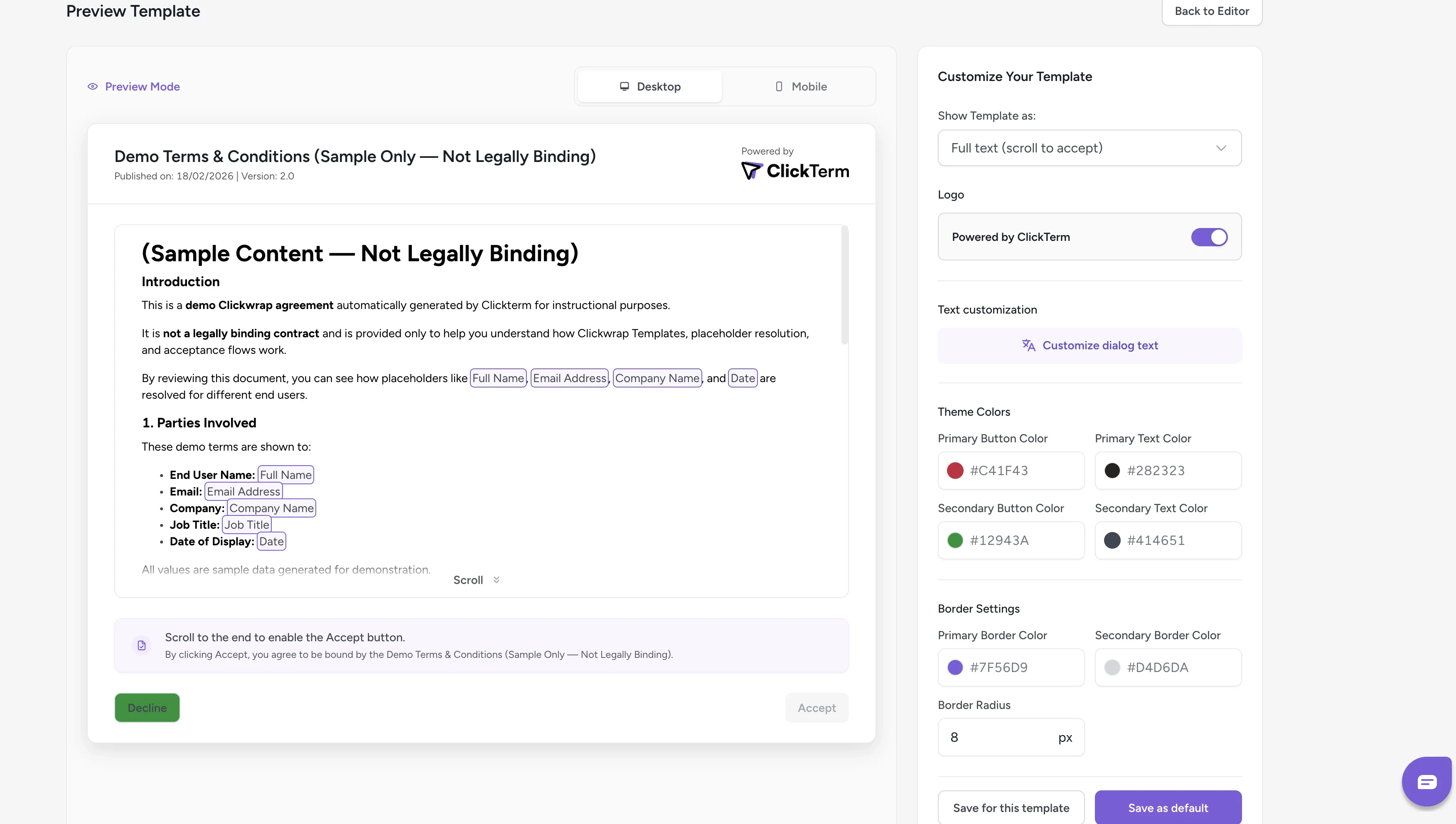 * **Left panel** — Displays a real-time preview of the clickwrap dialog
* **Right panel** — Contains all available customization options
As you modify the settings, the preview updates immediately to reflect your changes.
### Saving your configuration
You have two saving options:
* **Save for this template** — Applies the configuration only to the current template
* **Save as default** — Sets the configuration as the default for all templates that do not already have their own custom configuration
Changes will be reflected in the SDK after saving. It may take a few minutes
for the new configuration to propagate.
## Inline content
Starting from **SDK v2.2.0**, templates can include **Inline Content** — a consent checkbox with a short agreement line embedded directly in your page. This is used when calling `ClicktermDom.renderInline()` instead of showing a modal dialog.
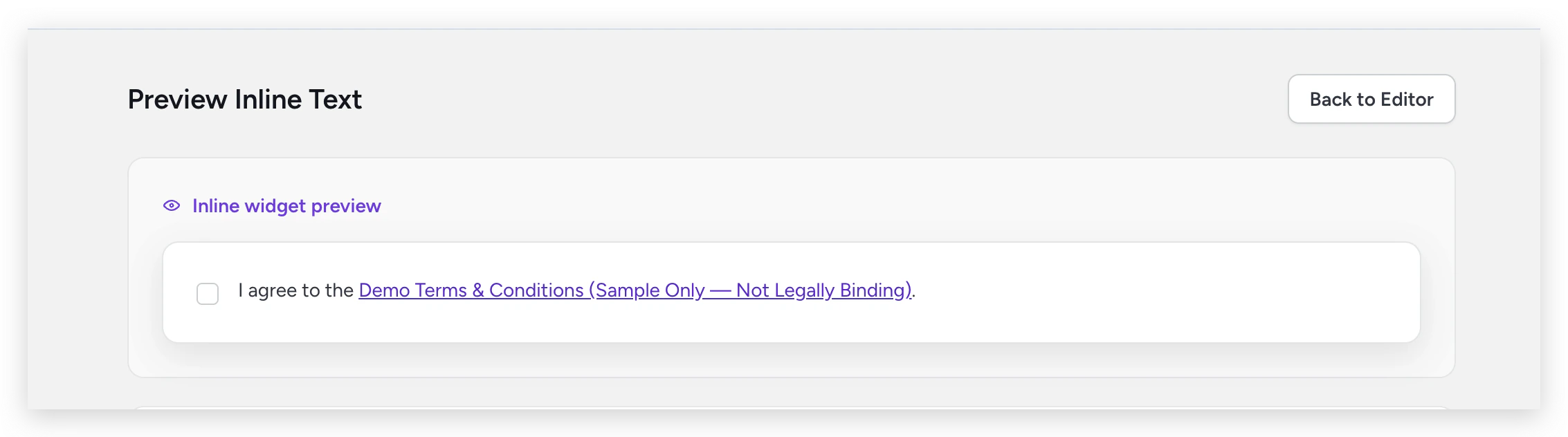
The inline content is configured in the [template editor](/product/templates/editing-content#inline-content). You can preview how it will appear to end users from the **Preview Inline Text** screen:
* **Left panel** — Displays a real-time preview of the clickwrap dialog
* **Right panel** — Contains all available customization options
As you modify the settings, the preview updates immediately to reflect your changes.
### Saving your configuration
You have two saving options:
* **Save for this template** — Applies the configuration only to the current template
* **Save as default** — Sets the configuration as the default for all templates that do not already have their own custom configuration
Changes will be reflected in the SDK after saving. It may take a few minutes
for the new configuration to propagate.
## Inline content
Starting from **SDK v2.2.0**, templates can include **Inline Content** — a consent checkbox with a short agreement line embedded directly in your page. This is used when calling `ClicktermDom.renderInline()` instead of showing a modal dialog.
The inline content is configured in the [template editor](/product/templates/editing-content#inline-content). You can preview how it will appear to end users from the **Preview Inline Text** screen:
 When the end user clicks a link in the inline text, the full clickwrap content is shown in a read-only modal.
### Inline styling
Unlike clickwrap dialog customization (which is dashboard-driven), inline appearance is controlled **via code** using the `style` option when calling `ClicktermDom.renderInline()`:
| Option | Description |
| -------------- | --------------------------------------------------- |
| Checkbox color | Accent color for the checkbox |
| Checkbox size | Size in pixels |
| Border radius | Rounded corners (e.g., `4px` or `50%` for circular) |
| Font family | Font for the agreement text |
| Font size | Font size in pixels |
For the full styling API and code examples, see the [ClicktermDom styling reference](/dev/sdk/web/clickterm-dom#styling-reference).
## Related
How to customize the clickwrap dialog from your integration code.
Full guide on rendering inline consent checkboxes.
Edit your template content and manage versions.
When the end user clicks a link in the inline text, the full clickwrap content is shown in a read-only modal.
### Inline styling
Unlike clickwrap dialog customization (which is dashboard-driven), inline appearance is controlled **via code** using the `style` option when calling `ClicktermDom.renderInline()`:
| Option | Description |
| -------------- | --------------------------------------------------- |
| Checkbox color | Accent color for the checkbox |
| Checkbox size | Size in pixels |
| Border radius | Rounded corners (e.g., `4px` or `50%` for circular) |
| Font family | Font for the agreement text |
| Font size | Font size in pixels |
For the full styling API and code examples, see the [ClicktermDom styling reference](/dev/sdk/web/clickterm-dom#styling-reference).
## Related
How to customize the clickwrap dialog from your integration code.
Full guide on rendering inline consent checkboxes.
Edit your template content and manage versions.